I recently completed a massive online course on Infographics and Data Visualization sponsored by the Knight Center for Journalism in the Americas. I wanted focus this post on summarizing my work and learning from this 5 week course.
My prime intent to take this course was to understand the realm of Data journalism, learn and perhaps encourage few more like minded folks to work with me on WiseVoter.org. I experimented with several tools and I’ll show case my progression of work with Adobe Illustrator, Tableau and finally with the powerful D3JS library.
**What is infographics? **We are a symbolic species – we can’t see trends text tables but if you represent the same data as a line graph we do! Pictures are worth a 1000 words! Infographics traditionally have communicated a story and data visualization has offered tools for readers to explore the data. However model infographics are combination of both and they serve the essential need for our brain to perceive the data!
**Elements of infographics style **Like any good interaction design, infographics should be designed with the audience in mind, the author should stress on the form of the graphic to follow its function. When critiquing or evaluating an infographic good areas to evaluate are – communication, data quality, form vs. function, copy of the graphic.
Form to match the function is of immense importance to a graphic, if you want to show a perfect comparison then using bubble is the wrong choice, bar graphs tend to represent comparisons more accurately. On the other hand if the data is fuzzy and intent is to show the relationship or patterns in data - bubbles work great! Here is a thought starter for choosing a chart! To represent color and font this guide from Dallas morning news can be helpful! For using maps this course has some good tips.
In general an infographics should have right balance of right and left brain, perhaps one can bring that out by playing on perception capabilities of human brain. It can draw from the visual information mantra – “overview first, zoom and filter, then details on demand”.
**Who to learn from? **There are a number of cools sites which cover infographics, following is a good list to start with -
-
New York Times is the gold standard for data journalism. The share their technique graciously at - http://chartsnthings.tumblr.com/archive
-
Nathan Yau – Flowing Data
-
Edward Tufte – Tufte.com
Lets try the tools! Take 1: With Adobe Illustrator
Using Adobe Illustrator I tried to redesign the New York Times infographics on colonoscopies. Illustrator is a gold standard to work with print graphics and it was very intuitive and fun to work with a photoshop like tool! The feature I digged the most was ability to create charts! However the downside of this is that one can’t do interactive designs with Illustrator, it’s the best tool for print or stagnant graphics.
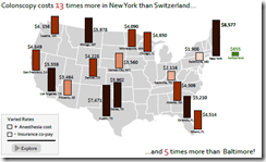 http://bit.ly/info-week4
Take 2: With Tableau
Next up is an fairly easy to use what you see is what you get data visualization tool – Tableau! This software is very popular in the business analytics community and it has powerful features to work with live data! The infographics created can be shared with the world using Tableau public and I redesigned lifestyle magazine’s graphic on who is buying what.
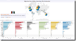 http://bit.ly/info-week5
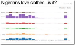
Take 3: With d3js
If you are a programmer, like me, d3js is the best tool for interactive designs! It has a tiny learning curve but boy you can do some cool stuff! Following is my redesign of who is buying what.
**What next?
**
So after getting the following certificate :
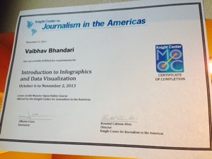 I’m planning to apply the above techniques to create some interesting infographics for http://www.wisevoter.org. If any of this interests you and you would like to collaborate, please leave a comment!